")
")
")
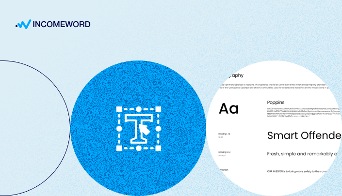
If you truly care about your readers and want your website to make a positive impression, your text should look good. The art of typography is responsible for the formatting of the text.
Contents:
- Page Margins
- Page Container Width
- Text Alignment Rules
- Font Families
- Standard Web Fonts
- Google Fonts
- How to Choose A Font Family?
- Headings H1 — H6
- Font Size
- Text and Background Color
- Paragraphs
- The Distance Between Paragraphs (Interparagraph Spacing)
- Number of Lines in A Paragraph
- Line Spacing
- Font Styles and Design: Bold, Italics, Underline, Highlighting
- Links
- Images, videos, graphics
- Numbered Lists
- Tables
- Quotes
- Specially Designated Blocks
- Content as a Navigation Element
With the emergence of digital technologies, typography has become just as relevant for web pages as it is for printed magazines. The goal of typography remains unchanged — effective communication.
When a graphic designer develops a website design, a separate page is dedicated to typography, where typical elements such as headings, paragraphs, links, etc., are demonstrated. You will likely find a similar page at the demo address of the purchased CMS template, for example,https://cassiopeia.joomla.com/typography.
Some brands go even further and not only choose a suitable font but develop their own. The font becomes an integral part of their identity, helping clients recognize and remember the brand.
For most, however, having their own font is not necessary. But it is essential to understand the type of information you are conveying through your website and the target audience for which it is intended.
Page Margins
Every webpage should have margins at the top, bottom, left, and right. Website pages are no exception.
For all standard pages, the margins should be consistent. No content elements should extend beyond the margins (except for those intentionally stretched to full width, such as banners).
 Screenshot of the OpenAI website. There are margins on the sides (orange lines on the screenshot) and at the top (green line). There is also a margin at the bottom of the page. All elements such as the logo, buttons, text, and images do not cross the set margins. However, the video playing in the background at the top of the page (highlighted by a red frame) stretches across the entire width of the page, disregarding the external margins. Some photo banners further down the page are also stretched.
If you are using a CMS (such as WordPress or Joomla) instead of coding your website in pure HTML (which is unlikely), it is probable that your theme (template) already has these margins set, and you don't need to do anything additional for this.
Nevertheless, page margins are an integral element of typography that you should be aware of.
Page Container Width
Book pages will be filled from edge to edge, excluding left and right margins. But web pages are a different matter. On a website, it is not necessary to use the full width of the screen for the main text of an article.
A container exists to limit the display of content in terms of width (usually there are no restrictions on length). Text, images, and other information are placed inside the container and aligned to its sides. However, the container itself does not necessarily have to have borders or other visible elements (unless specified by the design).
You may have noticed that many blogs or news websites limit the width of the text container, leaving a relatively narrow column, usually in the center. This trend of a slim container in the middle may have been influenced by social media platforms like Twitter or Facebook.
A thin column is easier to read than text spanning the full width of the screen. You can see the entire line of text at once, without the need to scan your eyes or move your head from left to right. This makes reading more comfortable, especially considering the increasing inches and resolutions of modern monitors.
However, other elements of the website, such as the main article image or news previews, may have a wider container or no limitations at all, while being on the same page. This is perfectly acceptable. The restrictions primarily apply to the main body of the article text.
A narrow text container is achieved by setting a maximum width in the website's code (for example, through CSS files). A convenient width for the main text container is considered to be around 700px, which should correspond to 40-80 characters per line.
 Screenshot from The New York Times website. For example, in the screenshot, the article text is contained within a container with a width of 600 px. However, the container for the blocks located below the main text is significantly wider.
Text Alignment Rules
Most often, text is aligned to the left (except for languages like Arabic, Hebrew, or Urdu). Left alignment, unlike full justification, avoids excessive spacing between words, resulting in a more natural text appearance.
Headings can be aligned to the left or centered.
Font Families
Standard Web Fonts
Standard font families are displayed without any issues in all browsers. For this reason, standard typefaces are called "web-safe" fonts. There is no need to install an additional font on your website; it is sufficient to specify its name in the CSS styles.
According to w3schools.com, the following fonts are considered web-safe:
- Arial (sans-serif);
- Verdana (sans-serif);
- Tahoma (sans-serif);
- Trebuchet MS (sans-serif);
- Times New Roman (serif);
- Georgia (serif);
- Garamond (serif);
- Courier New (monospace);
- Brush Script MT (cursive).
Google Fonts
https://fonts.google.com/ - These are free fonts, and there are many more compared to the standard ones. On the specific font page, you can get detailed information about the font, including usage rules (About & License tab).
To use a Google font on your website, you need to add a font link in the head section (1) and specify the font family for the selected element in CSS (2).
Here's how you would connect the Roboto font:
1) Insert the font link within the <head>...</head> tags:<head>
<link rel="stylesheet" href="https://fonts.googleapis.com/css?family=Roboto:400,400italic,700,700italic">
</head>
2) Apply the font to the website elements in your CSS file, for example, to the headings:h1, h2, h3, h4, h5, h6 {font-family: 'Roboto', sans-serif;}
This way, we have connected the Roboto font to the website and applied it to all heading types (from H1 to H6).
Most modern browsers support Google fonts. The method described above for adding fonts to a website is recommended because you're referencing the source directly. However, it's advisable to test the chosen font(s) after adding them to your website in all popular browsers.
If there are any issues with displaying the Google font, you can download its files and upload them directly to your website.
Since Google offers only one font format for download (TTF), if needed, you can add other formats such as WOFF, EOT, SVG using the generator at https://www.fontsquirrel.com/tools/webfont-generator.
As the font is non-standard, when opening your website, the font files will be loaded additionally by the browser, either from the external Google library or (locally) from your website. Additional font loading (especially local) may slightly slow down your website's loading speed.
For example, we tried using the Roboto font on this website. We tested the website's page on three services:
- With locally uploaded font files of Roboto.
- With externally sourced (Google) font files.
- A control test without any additional fonts.
PageSpeed Insights

The Google website speed test service detected a problem with fonts only in the test with the first condition (1) - with locally loaded font files. In the other conditions (2 and 3), the test did not identify any font issues.
Solarwinds

Solarwinds identified additional load in the font category when directly loading Roboto font files (1). Under other conditions (2 and 3), no additional load was found.
GTmetrix

GTmetrix showed similar results to the previous services. If you go to the Waterfall > Fonts tabs, you will see the files of the loaded fonts. In the first case, apart from the FontAwesome file, we see three additional files. All three files are related to Roboto, each corresponding to a different font weight, as indicated by their file names. We can see the exact additional weight of each file.
In the second test, no font files were found under the Waterfall > Fonts tab. However, the font is still loaded, but from an external source. To confirm this, you need to go to the All tab, where you will find the previously added font link in the head section.

The third test did not involve any additional fonts.
As a result, we can see that loading a custom font through the website using an external Google library has less impact on speed compared to local loading. Loading font files from a local source (i.e., hosting) shows the slowest result, but still does not have a significant impact on the overall speed assessment.
Please note that even without any changes to the website, the speed assessment of the website's loading may slightly differ in various tests. This occurs because the loading speed depends, among other factors, on aspects such as server connection or SSL certificate loading.
For headings and the main body of text, different font families can be selected. In other words, a page can have 2 or more font families included.
Screenshot of The Washington Post website page
If you want to find out which font is used on a particular website, you can do so by looking at the code of the selected element (by right-clicking on the text and selecting the appropriate option from the context menu) or by using special applications, such as the WhatFonts extension for Chrome https://chrome.google.com/webstore/search/whatfont
How to Choose A Font Family?
If the font is not a continuation of the identity, and you don't have a significant preference, choose the most suitable font from the standard ones. This ensures that it doesn't affect the page weight and loading speed.
If the standard fonts are not satisfactory, choose from the ones available in the Google library. Google provides a wide selection of fonts, each with its own style that can convey the character and mood of the text content.
Some fonts appear more formal and may be suitable for business communication styles. If you want to convey softness through your text (for example, in a blog about motherhood), it's advisable to avoid sharp, formal fonts and prefer fonts with rounded edges. Expressive and impactful fonts may be suitable for creative projects, expressing the artistic nature of your content.
Headings H1 — H6
The main heading on a website page is denoted by the H1 tag. Usually, it is the largest heading placed at the top of the page. It is recommended to have only one heading with the H1 tag on a web page.
Subheadings H2-H6, which are second, third, and other levels, have smaller sizes. The lower the level of the subheading, the smaller the font size.
The visual difference in the sizes of subheadings creates a hierarchy of text and helps users navigate the content of the page.
Apart from the size (font size), headings often differ from the main text in font weight. A bolder font appears more prominent.
In CSS, font weight is indicated by numbers (900, 700, 600, 500, 400) or words (bolder, bold). Numbers provide more precise control, but they are not available in all font families and may also depend on the font files installed on the website. However, the values "bold, bolder" are universal and applicable to all font families.
Font Size
For the main text of a page, a typeface size between 16 and 20 pixels is considered convenient, depending on the font family.
The H1 heading is the largest text on the page. The H2-H6 subheadings are progressively smaller, each according to its hierarchy.
Subheadings of levels H4-H6 are typically used less frequently in practice compared to H2-H3. You should determine how many levels of subheadings you plan to use. For example, if you plan to use only one level of subheading, it is better for it to contrast with the main heading and the main text. Let's say the chosen heading is H2; it should be something in between the main heading and the main text.
The font size of the main page heading (H1) can be approximately twice the size of the main text font. The font size of a medium-level subheading (H2 or H3) can be approximately 1.5 times larger. For instance, if the main text size is 16px, the main heading can be 32px, and the medium-level heading can be around 24px.
These are approximate figures. The difference in sizes can be greater or smaller depending on the website design. To test and choose font sizes, the following services can help you:
https://typescale.com/
You need to select the font size for the main text, and the service will suggest font sizes for the headings. You can choose the font size increment coefficient as well as the font family among Google fonts.
https://fonts.google.com/specimen/Roboto/tester
On the Google Fonts website, you can also test the appearance of the selected font, including the headings. In the example, the popular font Roboto is chosen. In the visual editor, you can see how the H1-H3 headings look, in addition to the main text.
https://fontjoy.com/
This service randomly selects three types of fonts: the heading, subheading, and main text. Each level has its own font size.
Text and Background Color
Classic white background for text is considered the standard as it is the most comfortable for reading. This especially applies to long articles. Reading text on a white background causes the least amount of eye strain.
It is also acceptable to use other shades of light background, such as light gray or light beige.
The text color should contrast with the background. If the background is white, the text should be black or dark-colored. And vice versa. Most sites follow these simple rules.
It is best to avoid wild colors, such as green text or red background, in web page design. Reading on a brightly colored background strains the eyes much faster than reading on a light background.
Paragraphs
The Distance Between Paragraphs (Interparagraph Spacing)
On web pages, paragraphs are indicated by a significant gap between them, which resembles an empty line.
Typically, the gap is achieved not by inserting an empty line but by using specified margins in the website's code (in CSS files) for the <p> tag.
The <p> tag is used to mark a paragraph in HTML markup. If you separate a paragraph by pressing Enter in the visual editor of your CMS, most likely the new paragraph will be denoted by this tag - <p>...</p>.
On web pages, it is not necessary to indent the beginning of each paragraph with a left margin, as is done in books.
Similar indents to paragraphs are usually applied to other elements of the page, such as headings, media content, or blocks. In recent years, web design has maintained a trend towards "airiness" - large gaps between any elements. As a result, blocks, paragraphs, and images do not appear "cluttered". Airiness in web page design helps to better perceive information.
Number of Lines in A Paragraph
The number of lines in a paragraph should not be too high, as long paragraphs are more difficult to comprehend. An optimal paragraph is considered to be no more than 5-10 lines.
Modern blogs tend to favor small, short paragraphs, sometimes consisting of just one sentence (even if that sentence is a short phrase or a single word).
 Pay attention to the paragraph lengths in articles of modern popular blogs. Screenshots from left to right: Neil Patel's blog, Ryan Robinson's blog, SEO PowerSuite Blog.
While striving for brevity, the meaning of the paragraph should not suffer. We must remember that a paragraph brings together sentences that support a single idea, are connected by a common meaning, or discuss a specific topic. The division of text into paragraphs serves as a kind of pause between thoughts and ideas, creating a rhythm and aiding in the easier comprehension of information.
Line Spacing
Line spacing refers to the distance between lines of text within a paragraph and is an important typographic element as it significantly affects text readability.
Excessively tight spacing makes reading difficult, just as excessive gaps between lines do. To ensure readability, it is necessary to find a balance between too-tight and too-loose line spacing.
General recommendations for setting the line spacing for body text are around 1.5, while for headings, it is around 1.2.
The number 1.5 means the multiplication factor. If for example, the font size is 20 px, then the line spacing set to 1.5 will equal 35 px. Many modern blogs set it to a higher value, such as 1.7 or even 1.9.
With the same line spacing values, text with different fonts may appear differently. This may require slight adjustments to the spacing, either increasing or decreasing it.
Font Styles and Design: Bold, Italics, Underline, Highlighting
The highlighted words and sentences in the text exist to emphasize their importance, add a special tone to the speech, and thereby draw additional attention from the reader.
Just like readers, Google also pays attention to bold words, which can be significant for SEO.
Links
Typically, links are highlighted in a different color from the main text (for example, the main text is black, and the link color is blue). Additionally, underlining is often used in link formatting, in addition to the colored appearance (although this is not mandatory).
Furthermore, links that have already been clicked on have a different color compared to links that have not been clicked on yet (for example, they turn purple).
Images, videos, graphics
The added media content should have margins, similar to paragraphs. The whitespace around the element enhances perception.
Placing photos in an article, with text flowing around them on the left or right, looks outdated. Placing the image across the full width is a more modern format.
If you want to add two or more photos in a row, you can align them in a single line instead of stacking them vertically. This way, the user won't have to scroll for a long time.
How to Reduce Image Weight Without Losing Quality
Numbered Lists
Usually, items in a list are aligned to the left side, which makes them more organized and easier to perceive. The specific styles for formatting numbered lists may vary depending on the context and website design. However, there are a few general rules that can be highlighted:
- For consistency, it is advisable to stick to one type of numbering within a single page. For example, Arabic numerals (1, 2, 3), Roman numerals (I, II, III), letters (a, b, c), or other symbols.
- Indentation. The text of the items in a numbered list usually has an additional left indentation. It visually appears as approximately 2-3 spaces.
- Consistent style for list items. For instance, if you start the list with a capital letter, format the rest of the list items in the same way. If you used periods at the end of one item, continue to do so for all items.
 Пример разметки списка в HTML, где
 <ul>...</ul> - начало и конец списка; <li>...</li> - начало и конец пункта списка.Tables
When adding a table, it often happens that it looks neat on the computer but doesn't fit within the width of the smartphone screen. This results in an annoying horizontal scroll at the bottom of the page.
Tables can have issues with responsiveness, but it's important to remember the principle of Mobile-first. If your table cannot adapt well to a narrow smartphone screen, it's better to use a different format to present the information.
For example, you can:
- Present the information as a numbered list or another simpler text format.
- Take a screenshot and replace the text format with an image of the table that automatically adjusts to the screen width (in this case, search engines won't be able to read the text and numbers in the table).
- Place the table within a scrollable block. This way, the scroll bar won't automatically appear at the bottom of the website page. The scroll will be directly below the table and won't affect the overall width of the page.
- Create a responsive table without using the <table> tag but instead using other tags that can change the order of blocks to fit the screen, such as the <div> tag and the CSS property "display: grid" (this requires understanding HTML and CSS).
Quotes
A quote can be highlighted using standard means, such as italics, and non-typical text alignment, for example, centered. But it is much better to define the style for quotes (and other elements) using CSS so that your styling options are not limited.
In HTML, there is a special tag intended for quotes - blockquote. Thus, all you need to do is place the quoted text between the <blockquote>...</blockquote> tags and define the style for blockquote in the CSS file.
 For example, how to add a quote in CMS Joomla: you just need to 1) select the portion of text that you want to format as a quote, and 2) click on a special icon (in this example, the free editor JCE is used), and the editor will add the selected text within "blockquote" tags. To remove the quote formatting, you can do the same. In other CMS platforms, you will likely find a similar button in the toolbar.
Usually, visually, a quote is indicated by parentheses: either large or small, or only parentheses at the beginning. You can also highlight a quote with a background, a different font, or a different font color.
 Quote examples on Medium and on Neil Patel's blog.
Specifying a separate style for a quote (such as a different font or background) directly in HTML (using the style attribute) is not entirely correct. Usually, this formatting mistake occurs when a user tries to change the text style using visual editor tools. Thus, a beginner clutters the main text with unnecessary code. With this method of styling, the user would have to modify the style in HTML for each quote, which is not very convenient. Consequently, the page will have additional weight due to repetitive code, and the user will spend more time on publication. A much better solution is to write styles in CSS files.
Specially Designated Blocks
In blocks highlighted by frames, backgrounds, or other design elements, there may be information that you want to emphasize. For example, important information, additional features, or warnings.
Styled blocks may contain information that is not directly related to the article's topic, such as advertisements, teasers leading to another article, or calls to action (e.g., prompting users to subscribe to an email newsletter).
 Examples of special block formatting: Neil Patel's Blog, SEO PowerSuite Blog, This Blog.
There are no strict rules regarding the design of a special block. However, the general typography rules of the specific page should be followed:
- The content of the block should not exceed the container.
- The text should remain contrasted against the background.
- The spacing (both within and outside the block) should correspond to other spacing on the page.
Content as a Navigation Element
For the convenience of navigation in an article, you can add a table of contents at the beginning of the article. This will help users orient themselves on the page.
The table of contents can be made even more convenient by adding anchor links to it.
Additional navigation in the form of a table of contents with anchor links is not a mandatory requirement. It is appropriate to add a table of contents to long articles with complex structures.
How to set up anchor links on a webpage?
Most design elements can be controlled through CSS files. If you're using one of the popular CMS platforms, you can create and link your custom CSS file. This way, you can ensure that any changes you make will not be lost when updating the CMS.
If your thoughts and ideas are the content, then typography is the form, the vessel, or even the packaging. Package your website content in a way that effectively conveys its meaning.